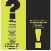
Started in 1995, InfrasoftTech is an India based company having offices in Mumbai, the UK, the USA, Singapore, Malaysia, Dubai, Bahrain and the Channel Isles. InfrasoftTechis an IT consulting and software solutions company and is one of the largest providers for anti-money laundering software services. They boast of having an exclusive clientele list across the world.
For a company having such a huge market presence and a boastful list of customers around the globe, InfrasoftTech was missing on the crucial corporate identity and presence in the corporate front. Vivid Brand Communication was roped in to transform the company’s brand image and to create a unique brand identity. The immediate aspect to be noticed with their branding was that each office of InfrasoftTech used different version of the logos which suited their respective sensibilities and local understanding. There was no standard logo which is a necessity when creating a uniform branding.
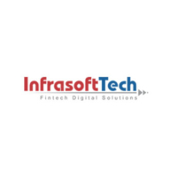
We began with designing a new standard logo which would reflect company’s values that were focussed on quality and excellence and which will be uniform across all their office. It was a major challenge to design the new logo as it involved assigning a matching font to it, since the earlier fonts had a mismatch across different versions of the logo. We created a special font for InfrasoftTech logo, one that precisely represents the essence and values of the company. Logo was embellished with red and blue colours that signified action and confidence.
The result of the strenuous efforts was well received across all InfrasoftTEch offices and the logo unanimously accepted. It became the new corporate logo for the InfrasoftTech India Ltd. With the help of the new logo we were able to establish InfasoftTech’s unique brand identity which was influential for the company, as they had new offices coming up to further enhance their new tie-up ventures and had a lot of recruitments lined up.
